
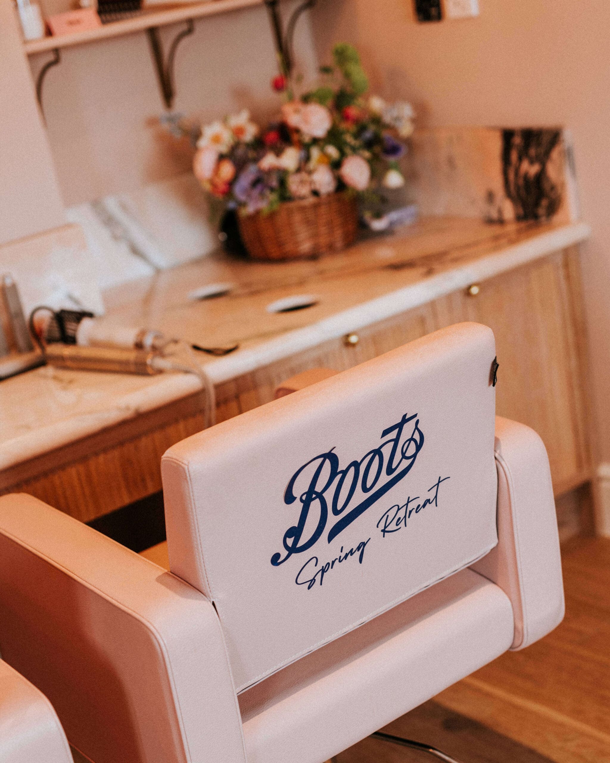
I recently had the absolute joy of creating the florals for a Boots PR and influencer retreat at Kin House in Wiltshire, hosted by the brilliant Heaps + Stacks. The event was designed as a pastel-toned celebration of the new season – a welcome to spring through beauty, ritual, and thoughtful styling – unfolding across several spaces within the house throughout the day and evening.
The brief was wonderfully uplifting: fun, bright, pastel spring flowers with a joyful energy. Colour was one of the most important design details, particularly the request for true-blue flowers to subtly reference the Boots brand, without anything dyed or artificial. That colour challenge became the thread that tied the whole design together.

The Floral Brief: Soft Pastels for a Spring Retreat
When the brief first landed in my inbox, what excited me most was the idea of creating flower baskets for the hair and makeup rooms. I loved the thought of bringing spring directly into those intimate, behind-the-scenes spaces where the day would begin.
Blue is key to the Boots branding, and finding natural blue flowers that had a touch of whimsy rather than being too bright or bold influenced many of the decisions that followed. It was important that everything needed to feel fresh, optimistic, and celebratory – a proper spring awakening.
Floral Design Across Kin House
The event unfolded across three main areas of Kin House, each with its own distinct floral story.
In the dressing room, where the hair and makeup tutorials took place, I created relaxed baskets of flowers to soften the space and bring that first breath of spring into the room. These designs were intentionally informal; seasonal, loose, and of course, wonderfully abundant.
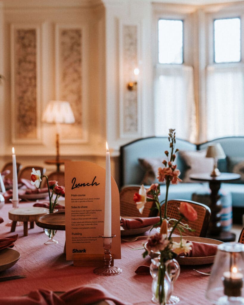
For lunch in the Drawing Room, the palette shifted into soft pinks. The tables were dressed with bud vases filled with frilly, delicate pink flowers, creating a romantic mood that felt perfect for the middle of the day. It was unfussy yet bursting with detail, one of those moments where even the smallest designs carry a big atmosphere.
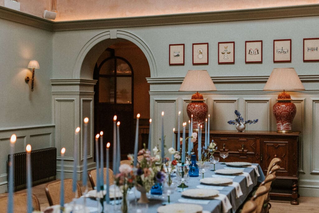
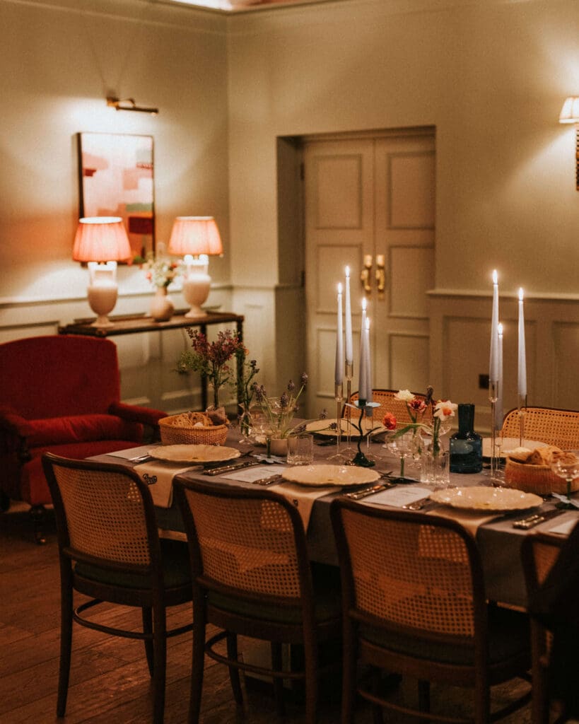
Dinner in the Hearth Room returned to a cooler palette centred on blue. Here, I created a full pastel tablescape using a mix of bud vases, ikebana designs, and footed floral bowls. This final candlelit setting felt layered and immersive, becoming the visual heart of the evening.
Spring Florals and a Pastel Blue Palette
Across the event, I worked with a beautiful mix of spring ingredients, including tulips, ranunculus, sweet peas, daffodils and narcissus, anemones, poppies, and scented lilac. Each flower was chosen for its hue, movement, and seasonal character.
The undeniable talking point, though, was the blue muscari ikebana bowls. Finding natural blue flowers was essential, and the muscari, being completely of the moment and graphic in form, delivered that colour story perfectly.
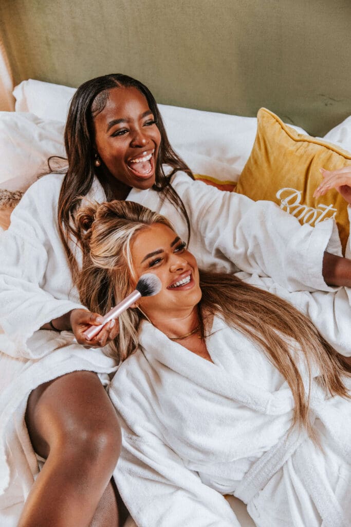
The overall mood of the retreat genuinely felt like a proper girly sleepover, layered with cushions, soft furnishings, and candlelight throughout the bedrooms and shared spaces. While the candles weren’t part of my brief, I can’t not mention the pale blue candles sourced by the Heaps + Stacks team. Used at different heights along the tables, they were truly beautiful and perfectly aligned with the floral palette.


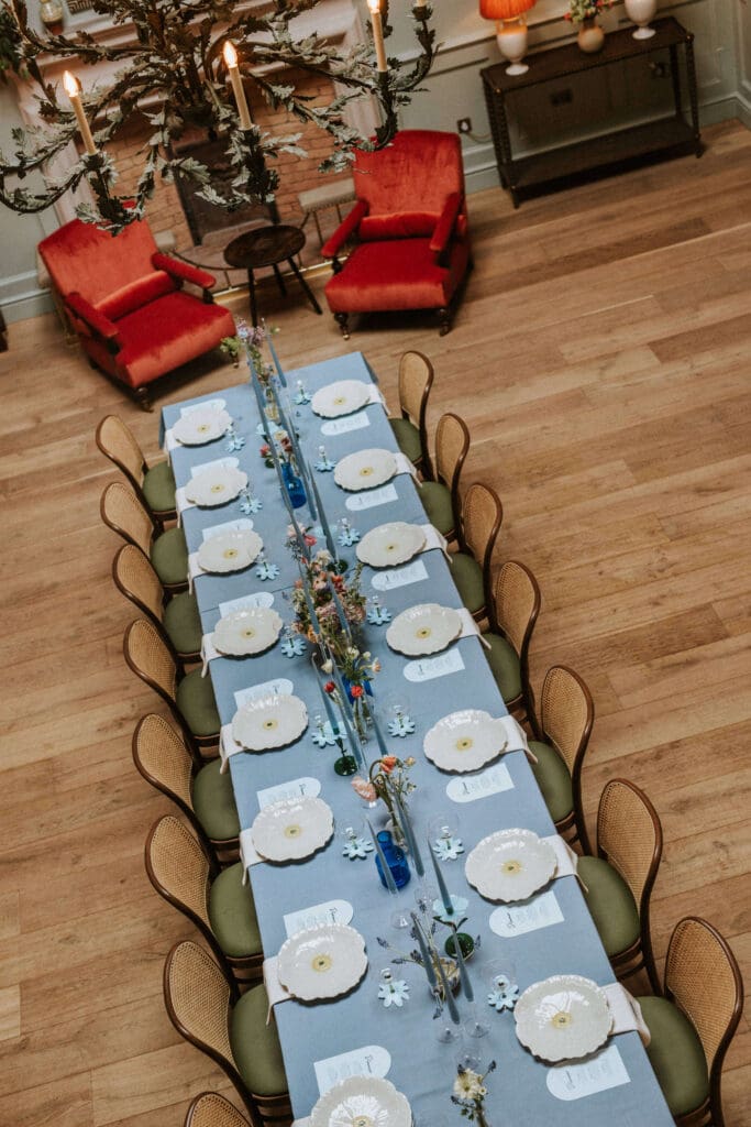
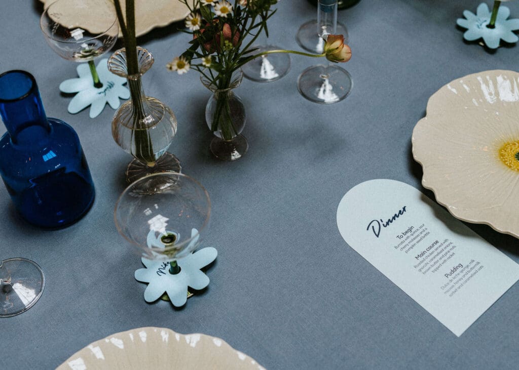
The Hearth Room Dinner Tablescape
My personal highlight of the entire project was the blue dinner tablescape in the Hearth Room. Alongside the florals, Heaps + Stacks introduced daisy plates, blue floral candlesticks, and die-cut floral place names, elevating the whole setup to something super stylish and yet completely cohesive.
The blue linen kept everything feeling fresh and modern, and the overall effect was exactly what I believe spring should feel like: bright, optimistic, and full of promise.
A Spring Moment at Kin House
This brilliant project was a reminder of just how expressive pastel spring floral arrangements can be when they’re allowed to stay natural rather than overly styled, especially for an iconic brand like Boots, in a setting as beautiful as Kin House. It was a real highlight for me: a celebration of spring, seasonality, and thoughtful design, and a genuinely special way to mark the transition into the lighter months.

https://shorturl.fm/J3Yj9