Damson Madder arrived at Kin House in autumn with two milestones to celebrate: the launch of their A/W collection and their very first step into homeware. It felt like a natural pairing from the start. Their world of rich colour, confident pattern and considered production landed effortlessly within Kin’s layered interiors, and florals became the bridge between fashion, ceramics, food, and atmosphere.
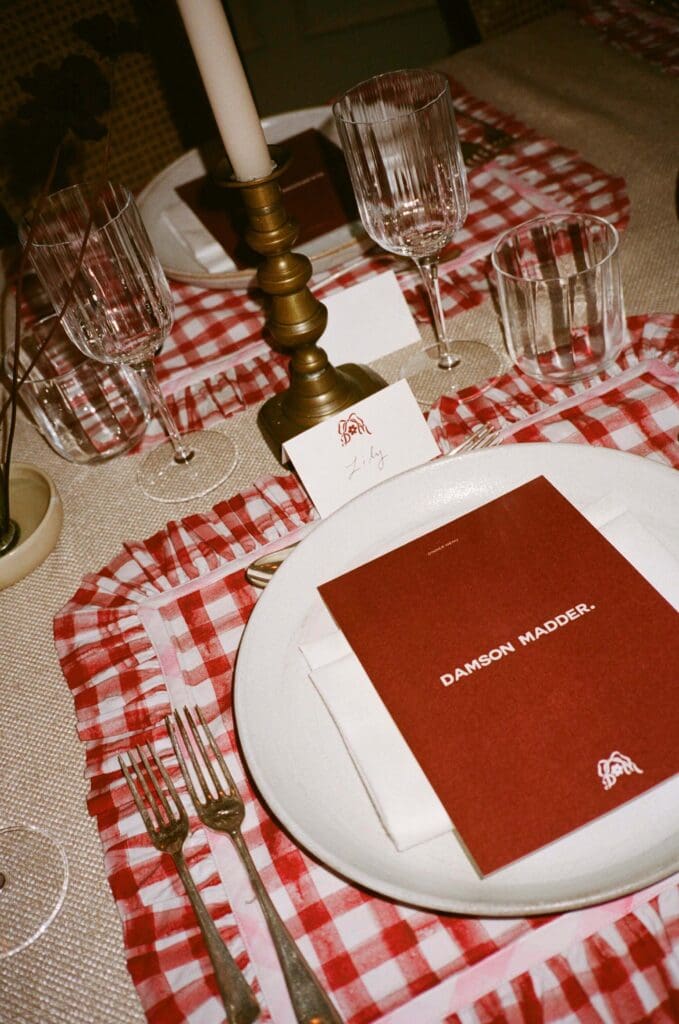
I was commissioned to design the flower arrangements for both lunch and dinner, using Damson Madder’s new gingham ceramics as part of the styling. The brief centred on creating abundance for day and drama for night – two distinct moods within the same house, tied together through colour, texture and personality.
Autumn Florals for Lunch in the Hearth Room
The welcome lunch in the Hearth Room was all about generosity and warmth. The tables were lined with Damson Madder’s pink and green gingham ceramic vessels – chunky, playful, and full of character – which became the foundation for the floral story.
To ensure the arrangements felt elevated rather than twee, I worked with textural autumn ingredients, balancing the cheer of the ceramics with natural depth and movement. Each vase had its own personality, but together they created a relaxed, fun vibe across the room, with floral clusters that felt collected rather than styled, designed to sit comfortably alongside food, conversation, and the initial excitement of the launch.
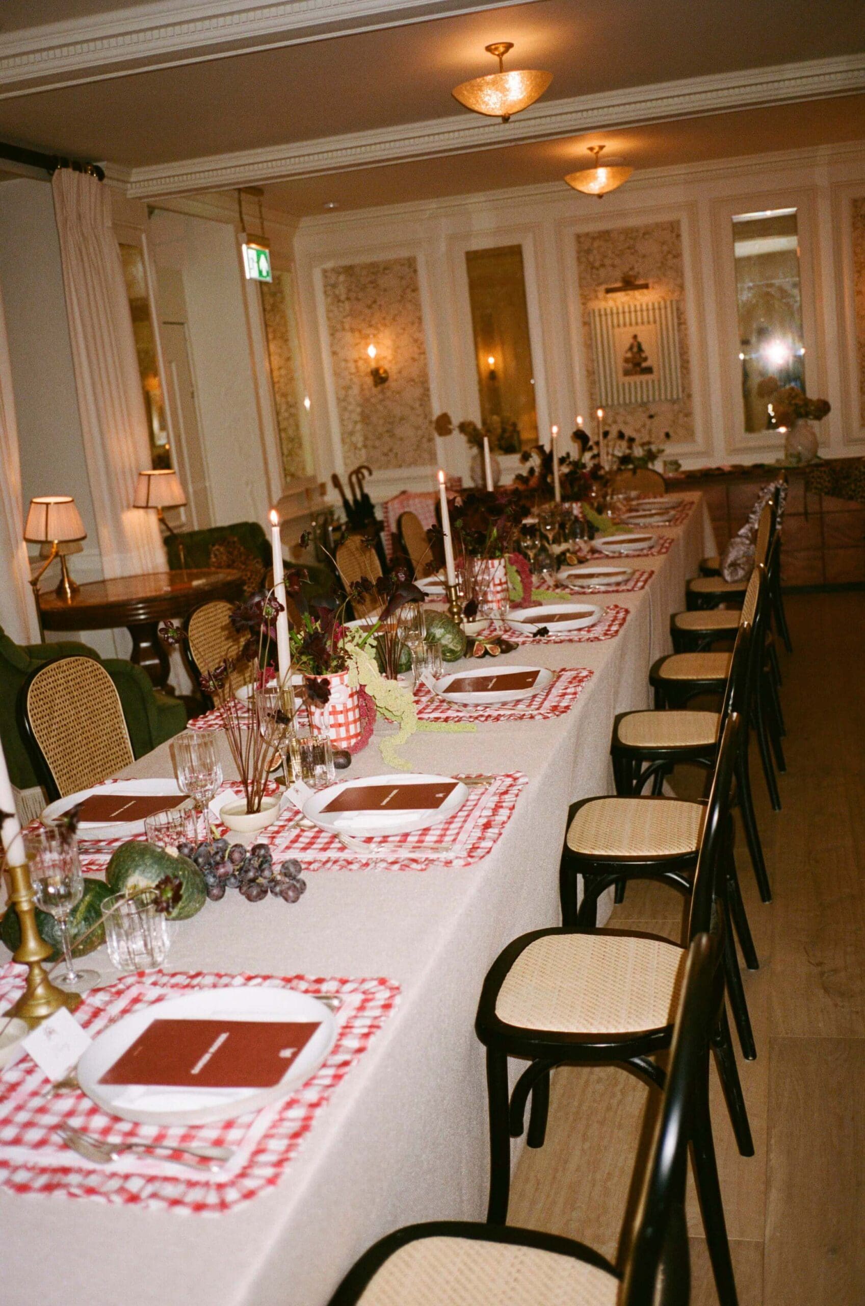
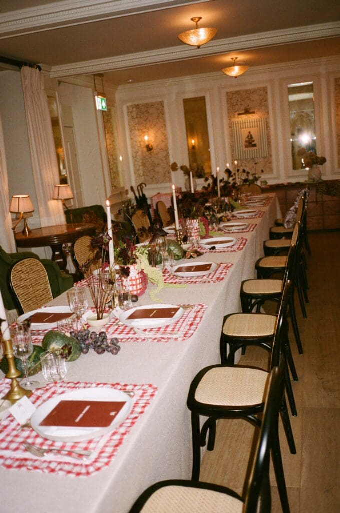
Dark, Sculptural Tablescaping for Dinner
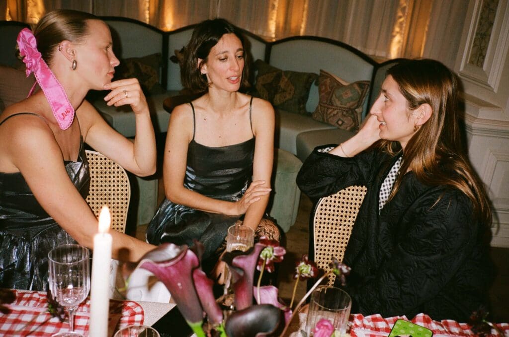
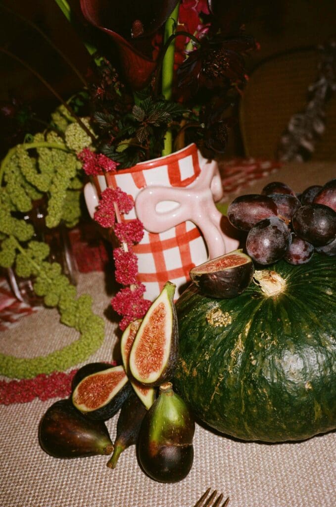
Dinner moved into the Drawing Room, where the brief changed to dark, moody and candlelit, with impact at its core. Deep burgundy became the anchor for the palette, supported by chocolate cosmos, zinnias, calla lilies and trailing amaranthus for shape and drama.
Ikebana bowls brought sculptural form to the table, while larger arrangements in red gingham vessels added weight and height. Dark green gourds ran through the tablescape, punctuating the florals with tone and contrast, and figs and grapes were scattered amongst the stems to add richness and indulgence.

Damson Madder’s World, Interpreted in Flowers
Damson Madder’s love of pattern and colour gave me permission to lean into contrast and structure, particularly for the evening tables. Burgundy against dark green, soft petals against firm, glossy gourds, and sculptural lines softened by movement.
Using their ceramics as vessels was also deeply satisfying as a designer because they weren’t props; they were the product itself, fully embedded into the vision of the day. Watching guests interact with them, pick them up and comment on them – that’s when a homeware launch truly becomes real, and spotting familiar faces like Laura Jackson and Pixie Geldof enjoying the tables only added to that feeling.